Tiny Threads
Children’s Clothing Marketplace App Design
Role: UX Designer | Time: 3 months | 2026 | Tools: Figma, User research, Prototype
Understanding The User
User Research
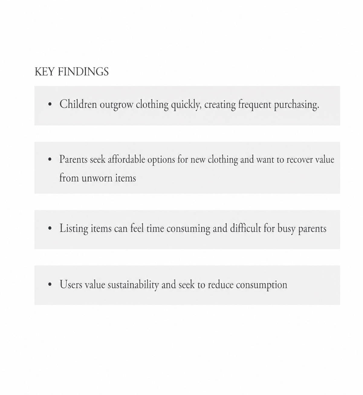
Through interviews with parents, I discovered that affordability wasn't the only challenge. While parents wanted access to affordable clothing, many were equally frustrated by the effort required to resell items their children quickly outgrew.
The research revealed an opportunity to create a platform that supports both sides of the experience-helping parents purchase quality secondhand clothing while making the resale process faster and less time-consuming.
Project Overview
Tiny Threads was created to address common challenges parents face when managing rapidly outgrown clothing, including cost, convenience, and sustainability. I designed an intuitive mobile experience that makes it easier to manage the responsibilities of being a parent.
The Problem
Parents spend money on children’s clothing that is quickly outgrown, creating financial strain and unnecessary waste. There is a need for an accessible platform where families can buy affordable, high-quality secondhand clothing and resell items to recover value.
The Goal
Create a trustworthy platform that enables parents to easily buy and sell gently used children’s clothing, reducing financial strain while extending the life-cycle of garments. By making high-quality secondhand clothing more accessible, the platform aims to support families, promote sustainable consumption, and minimize unnecessary waste
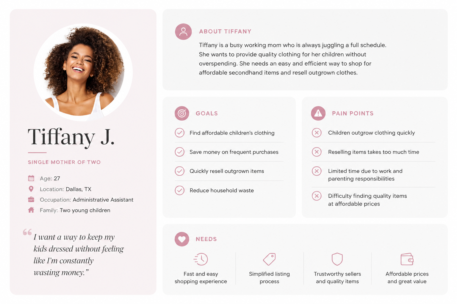
User Persona
A persona was developed through interview insights to represent goals, motivations, and challenges of target users.
User Journey
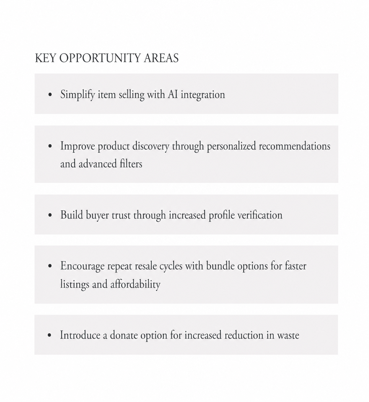
Using Tiffany’s goals and frustrations as a guide, I mapped her journey to identify opportunities for a faster and more intuitive resale experience.
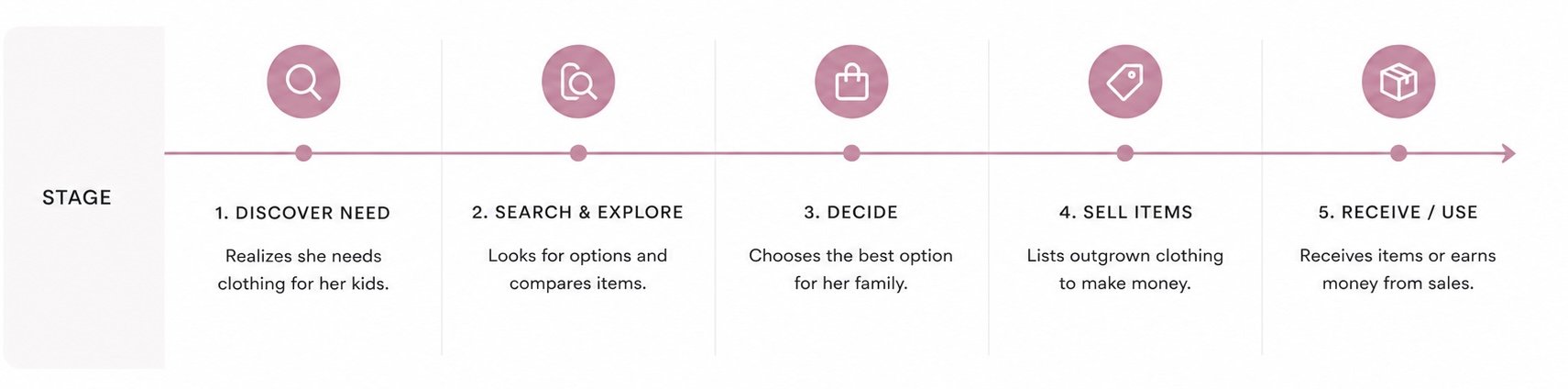
With the User Journey Map we able to identify pain points in the buying and resale experience. There is frustration with the constant cycle of buying, trying to find affordable options, and being overwhelmed with the selling process or wasting clothing.
“I want an easier way to buy my kids affordable clothes and make back some of what I spent. It feels like I’m constantly throwing money away.”
Simplified Navigation
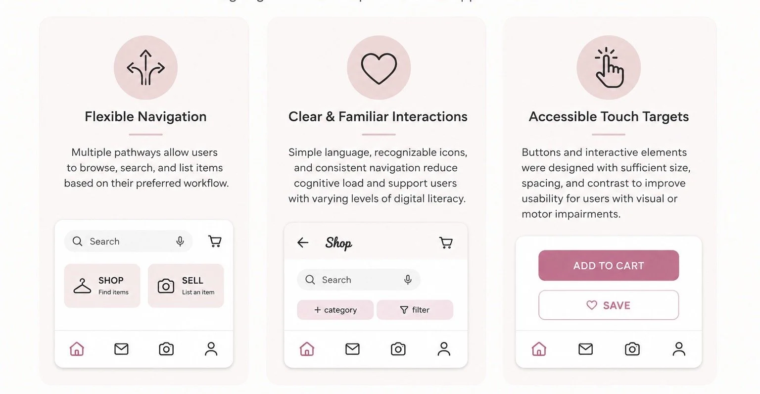
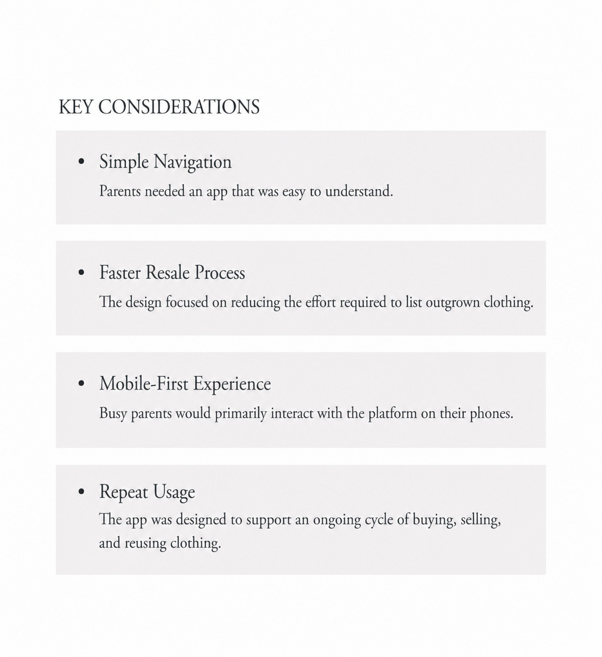
Users quickly understood the buying experience, so the design focused on keeping navigation intuitive and reducing unnecessary decision points.
Streamlined Selling Process
Research showed users wanted a faster listing experience, leading to features like AI integration that reduce manual entry and simplify item uploads.
Reduced Visual Redundancy
Several interface elements were consolidated to create a cleaner, more focused experience.
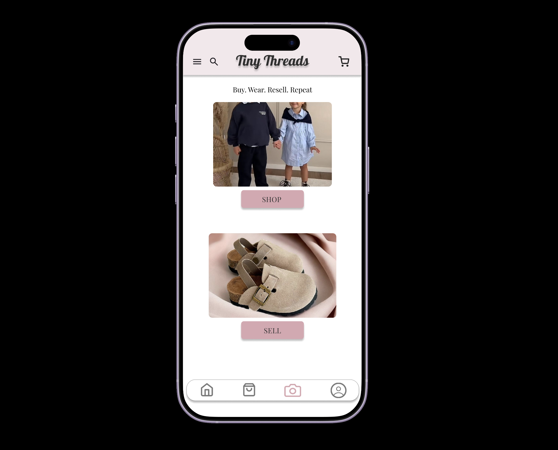
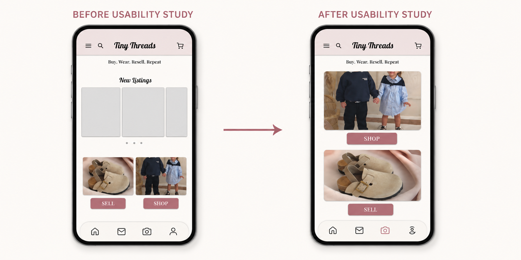
Clear Buy & Sell Entry Points
The homepage maintained distinct actions for buying and selling because users responded positively to this structure during testing.
AI-Powered Listing Experience
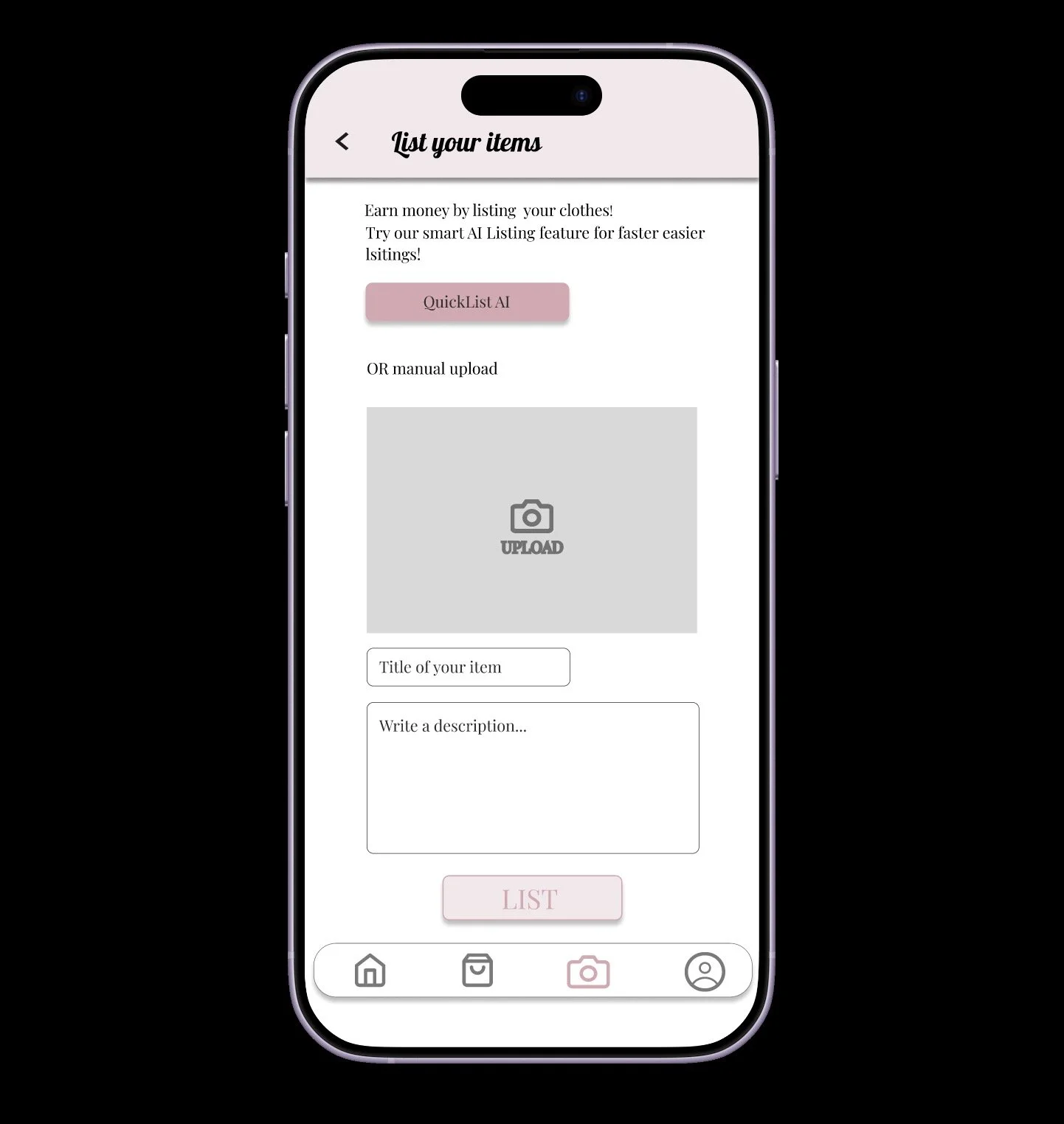
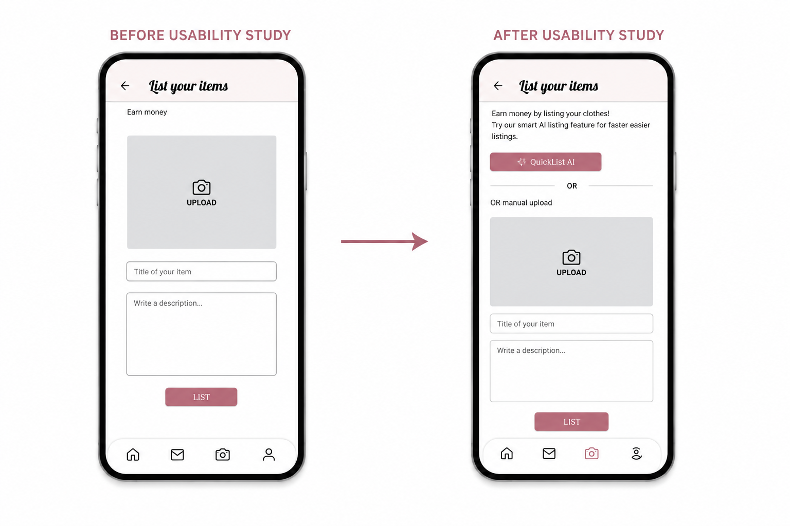
Usability testing revealed that manually creating listings was one of the biggest pain points for parents. Participants wanted a faster, less repetitive process that required fewer manual steps when selling children’s clothing.
To address this, I introduced an optional AI-assisted listing feature that helps users generate item details more efficiently while preserving the existing manual upload option. The redesign maintains a clean and familiar layout by presenting the AI feature as a clear secondary action rather than overwhelming the interface. This solution streamlines the listing experience without sacrificing the simplicity and ease of use that users valued throughout testing.
Final Prototype
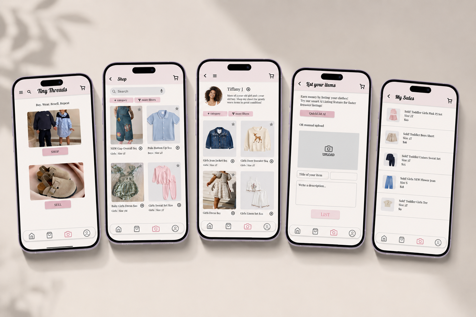
The final prototype combines insights gathered through user research and usability testing into a streamlined marketplace experience. Each design decision focused on reducing friction, improving discoverability, and helping busy parents buy and sell children’s clothing with ease and confidence.
Accessibility
This project reinforced the importance of validating design decisions through user research rather than assumptions. Small usability changes—such as improving visual hierarchy, simplifying navigation, and reducing friction in the listing process—had a significant impact on the overall user experience. Iterative testing helped transform user feedback into meaningful design improvements while maintaining a clean and intuitive interface.
Reflections & Next Steps
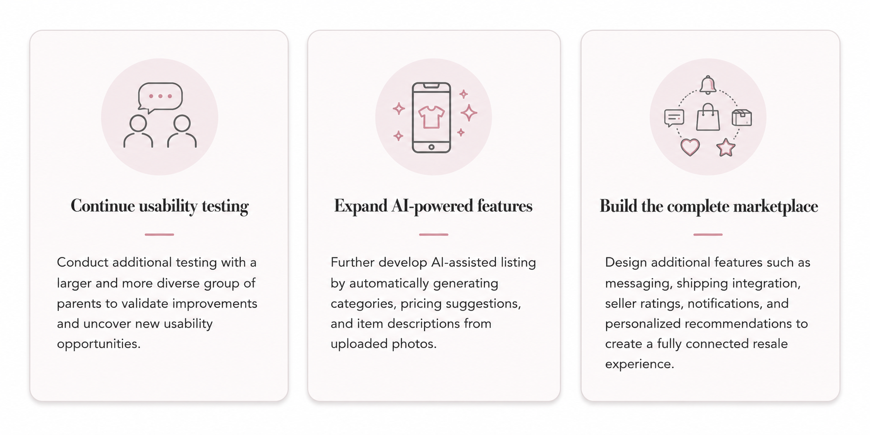
Next Steps
Refining the Design
Starting The Design
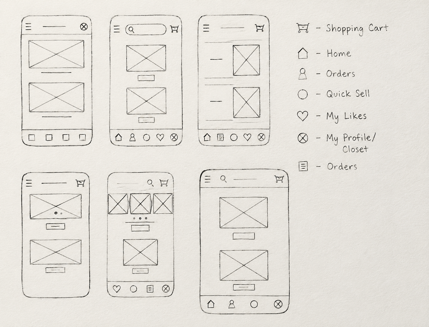
Paper Wireframes
Early paper wireframes helped me explore navigation, screen layouts, and key user flows before moving into digital design. This process allowed me to quickly test ideas and prioritize a simple, intuitive experience for parents.
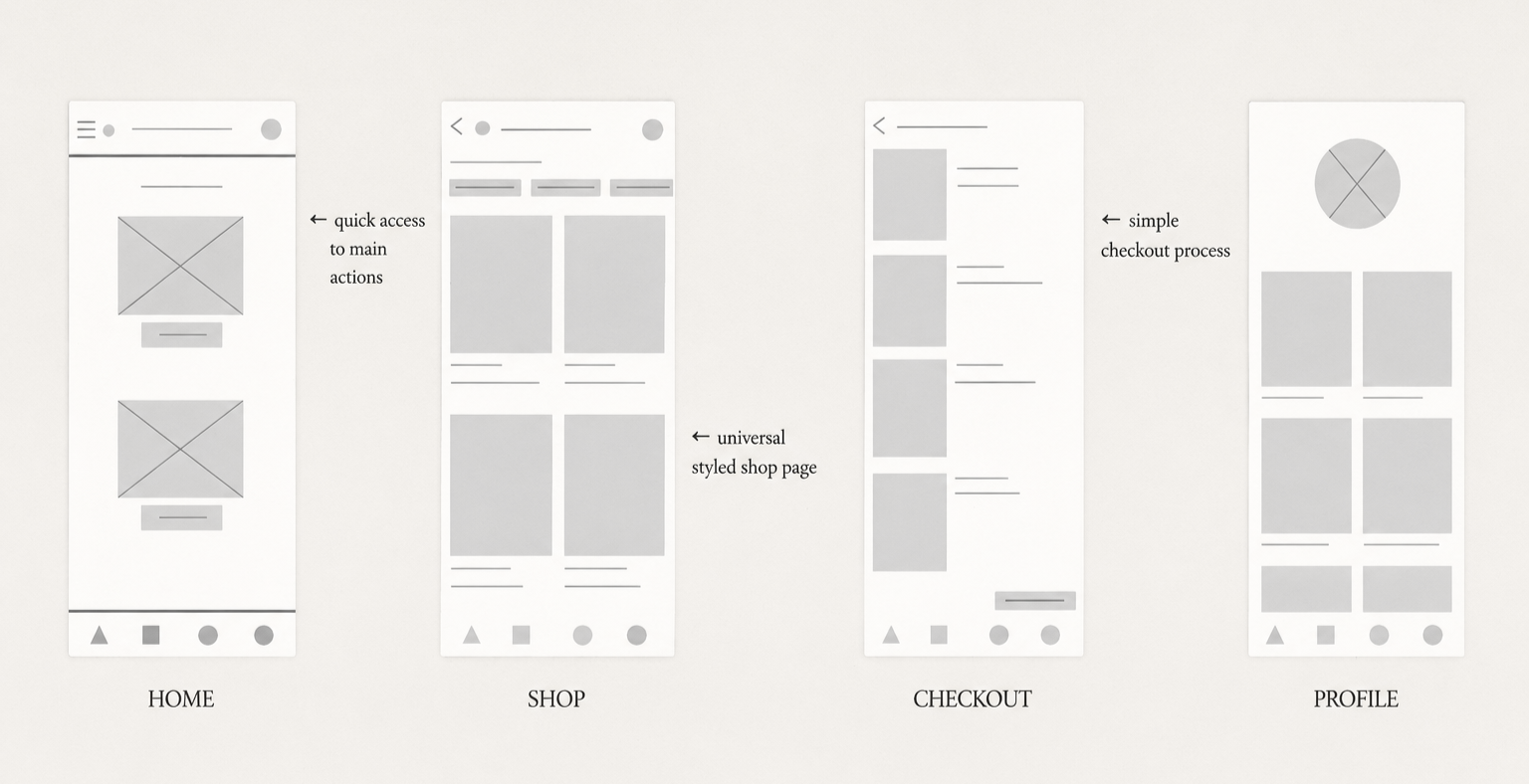
Digital Wireframes
Using insights gathered from user research, I translated early concepts into digital wireframes using Figma. The focus was on simplifying navigation, reducing friction in the resale process, and creating a mobile-first experience that would feel intuitive for busy parents.
Low-Fidelity Prototype
Using the digital wireframes as a foundation, I created a low-fidelity prototype in Figma to test navigation, task flow, and overall usability. The prototype focused on helping users quickly browse, purchase, and resell children’s clothing with minimal effort.
ORDER FLOW EXAMPLE
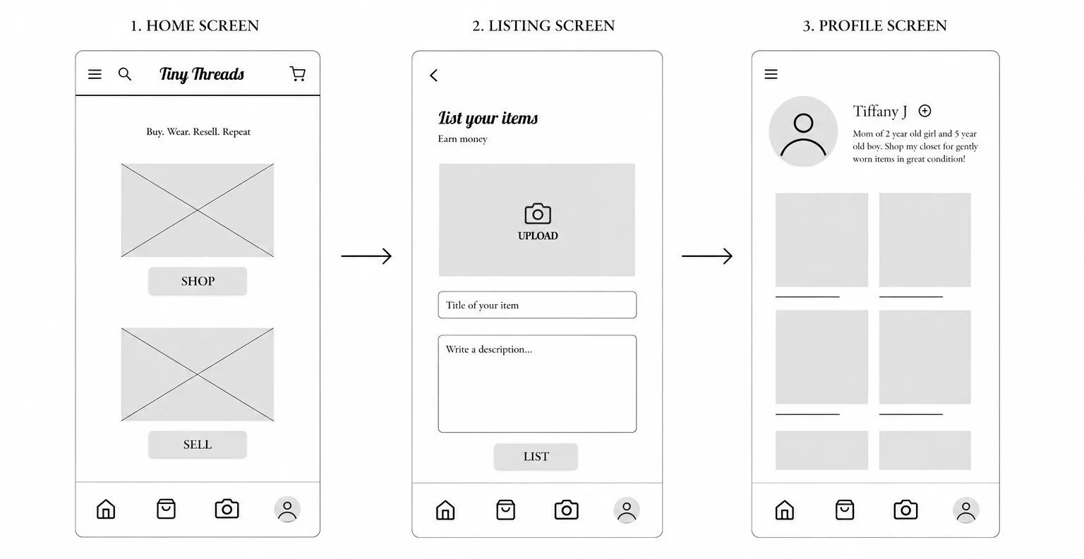
Bottom navigation bar for quick access to shopping, selling, orders, and profile management
Simple listing process for faster process and reducing friction
Mobile first layout designed for busy parents who primarily use their phones
Usability Testing
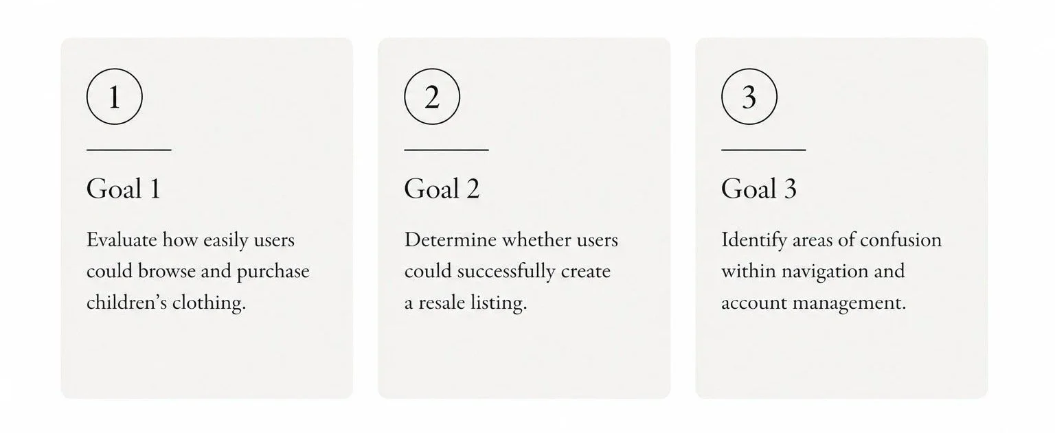
I conducted an unmoderated usability study to evaluate navigation, identify friction points, and better understand how users interacted with the app. The usability study was designed to evaluate the core user flows and identify opportunities to improve the overall experience.
Key Findings
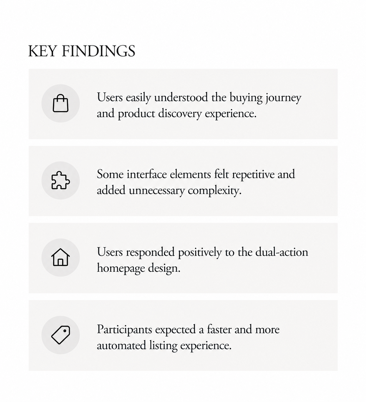
Usability testing validated many of the core design decisions while also revealing opportunities for refinement. Participants were able to navigate the shopping experience with ease and quickly understood the platform’s primary buying and selling functions. Feedback highlighted a desire for a more streamlined listing process with fewer manual steps, as well as clearer organization between shopping and resale features. These insights informed the final design improvements and helped prioritize a more intuitive, efficient user experience.
Clearer Entry Points
Usability testing showed users responded well to having distinct buying and selling actions. The redesigned homepage places these primary actions at the forefront, reducing decision-making and helping users immediately understand the app’s purpose while maintaining a clean visual hierarchy.
Improved Product Discovery
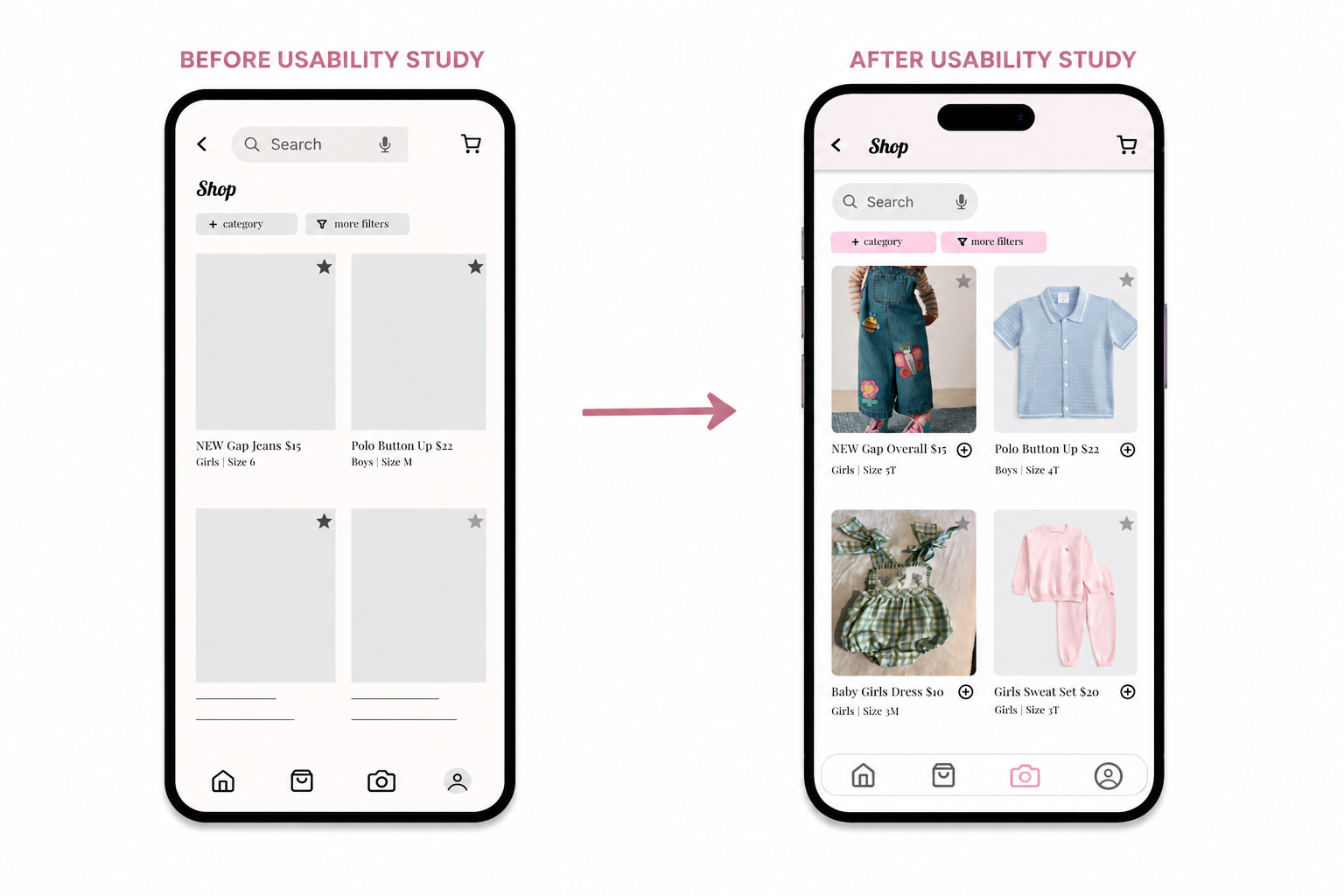
Usability testing highlighted opportunities to improve the browsing experience by making key actions more accessible and reducing unnecessary steps. The shop interface was redesigned with a stronger visual hierarchy, clearer product organization, and more prominent filtering options to help users quickly scan and compare listings.
To further streamline the shopping experience, quick add-to-cart buttons were introduced directly on each product card, allowing users to add items without first opening the product details page. These refinements reduce friction, support faster decision-making, and create a more efficient browsing experience while maintaining a clean, uncluttered interface.
What I Learned
This project reinforced the importance of validating design decisions through user research rather than assumptions. Small usability changes—such as improving visual hierarchy, simplifying navigation, and reducing friction in the listing process—had a significant impact on the overall user experience. Iterative testing helped transform user feedback into meaningful design improvements while maintaining a clean and intuitive interface.
Thank you for viewing this case study.
Let’s work together!